Work > All Projets
Annual Cultural Guide:
Publication & Layout Design
For the Popular Festivals of the Municipality of Sertã, we developed a print guide with a primary focus on user experience.
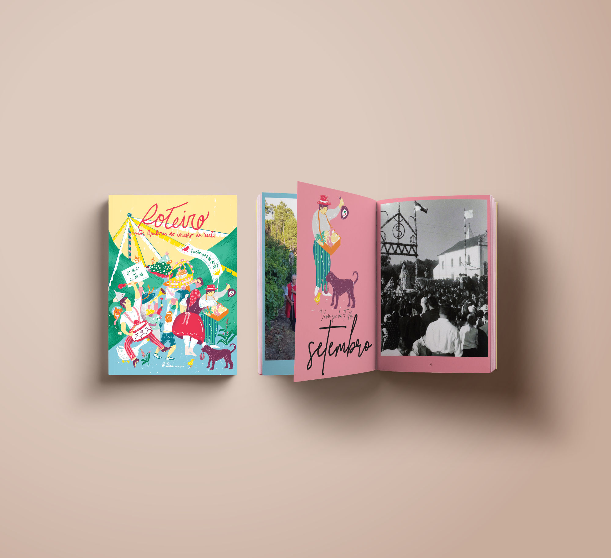
Since 2023, we have designed the guide in a tiny, compact format that is effortless to carry and consult. The design prioritizes clarity and accessibility, using a dynamic, colorful layout to organize key information—history, traditions, dates, and locations.
This approach transforms a simple guide into an indispensable practical tool and a cultural companion, ensuring it is both beautiful and highly functional.
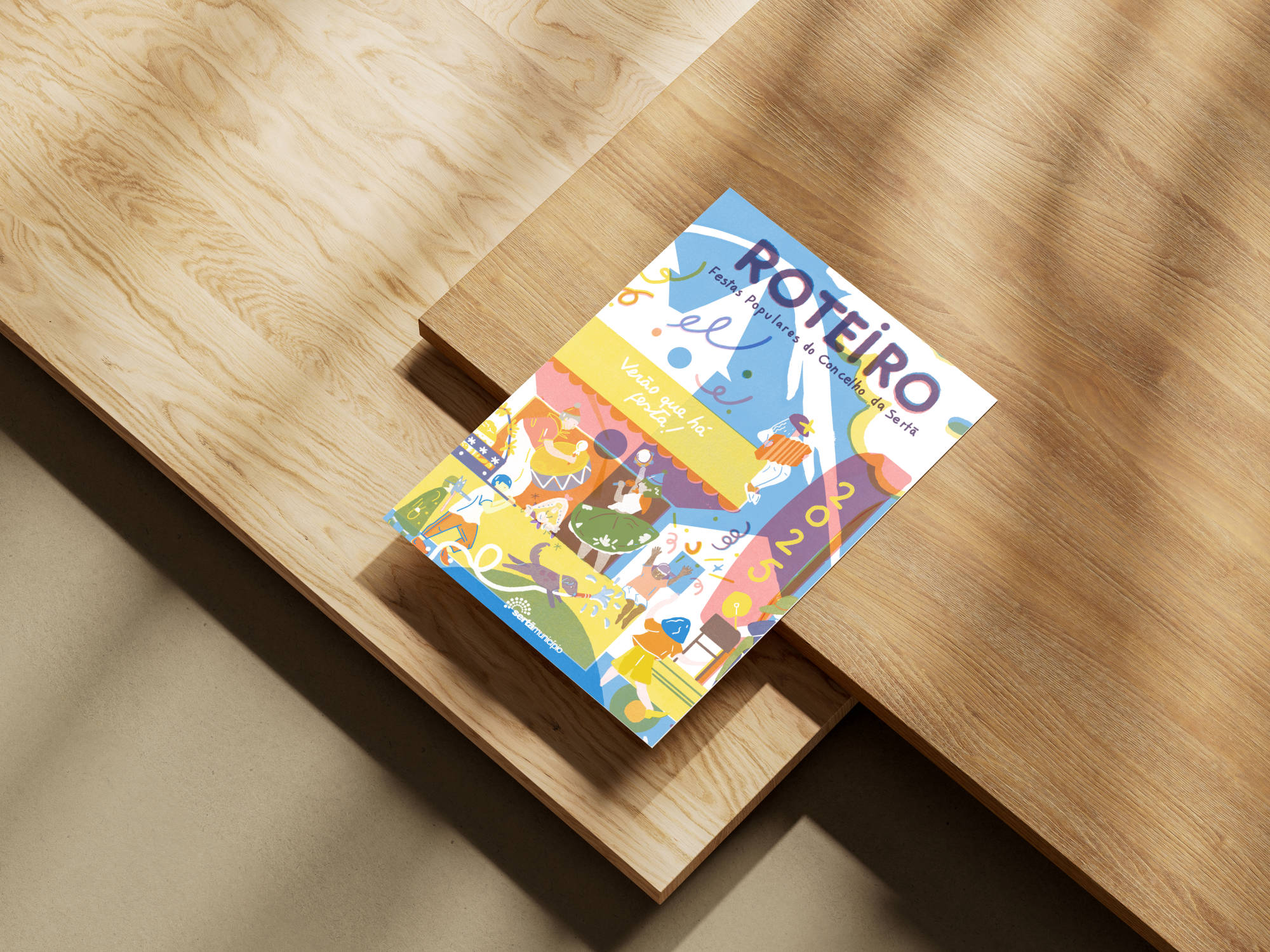
Cover Illustration: Carolina Maria
01 >
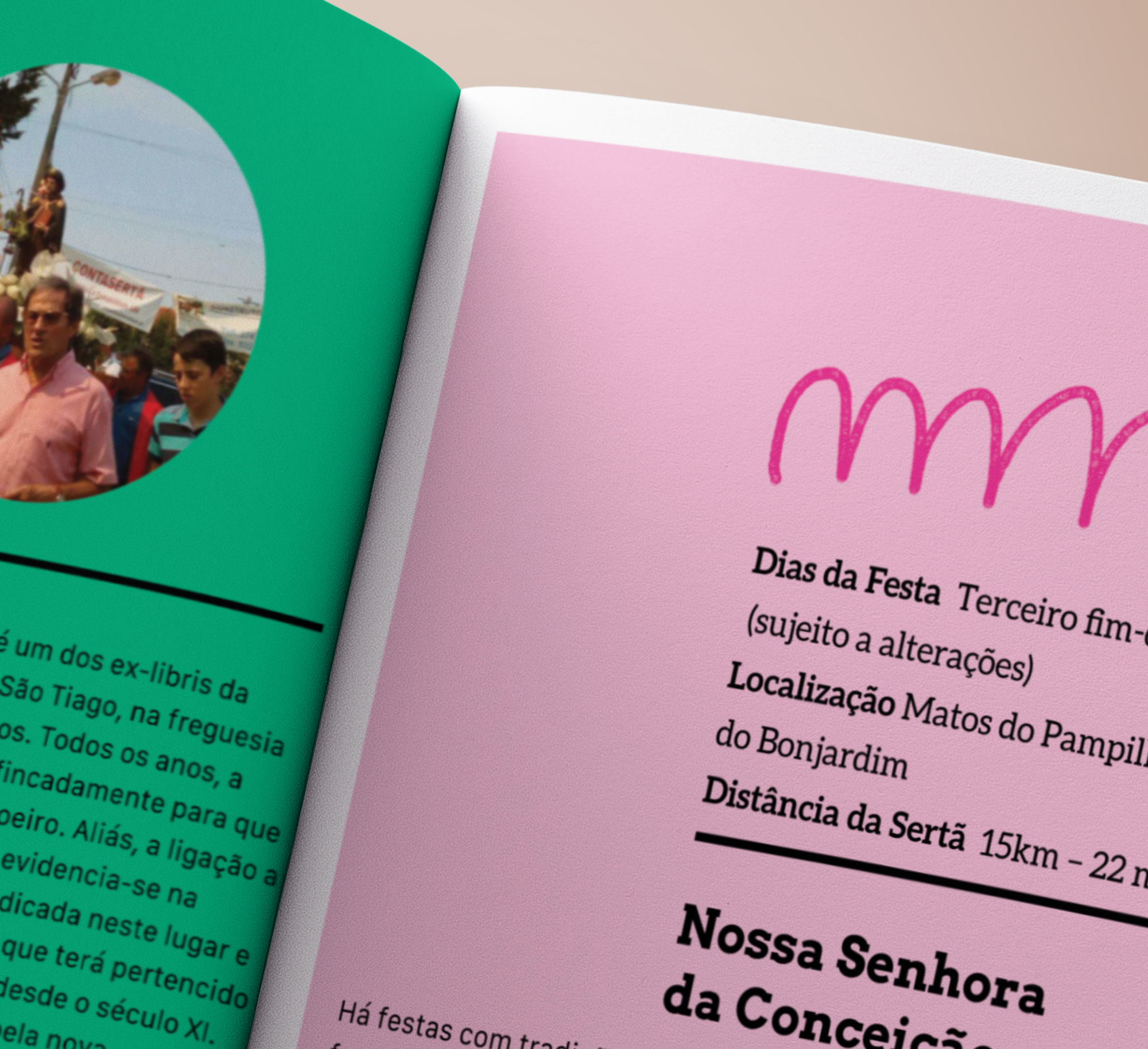
Readability and Visual Harmony
Readability is our top priority. We used a clean grid system and selected elegant fonts to create a layout that is both harmonious and easy to read. This allows users to quickly scan the schedule or read a detailed event description with ease.
02 >
Layout and Information Flow
The design was created with a focus on clear and intuitive information flow. By structuring the content with a logical hierarchy, we organized the program so that readers can effortlessly browse through it, quickly finding the events they’re looking for. This approach transforms a dense schedule into a clear and practical guide.
03 >
Evolving Our Design
To keep the programme fresh and dynamic, we make a strategic choice to invest in a unique design and layout for each annual edition. This allows us to re-evaluate and optimize the information structure every year, ensuring each guide feels new and is perfectly tailored to its context.
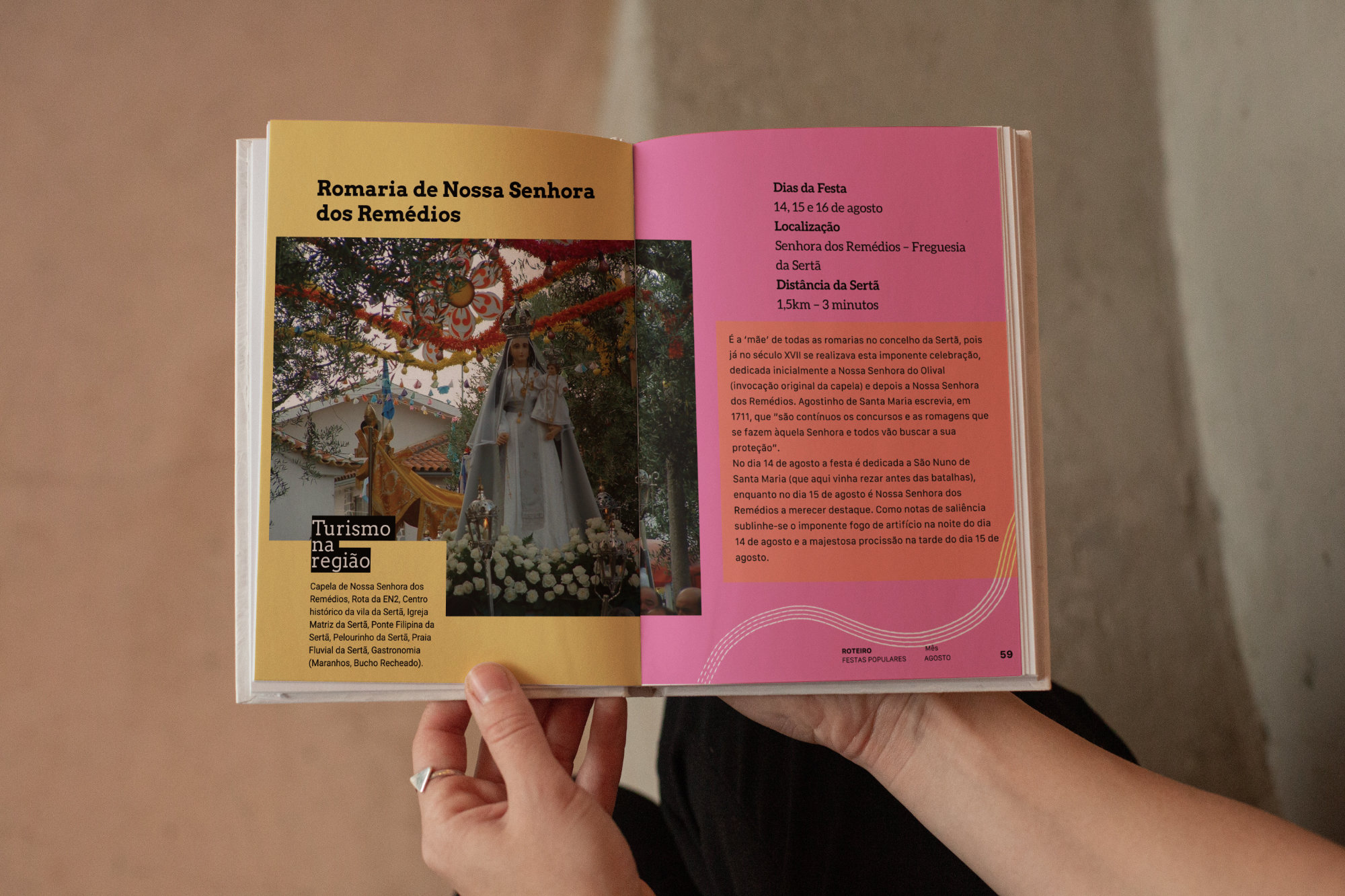
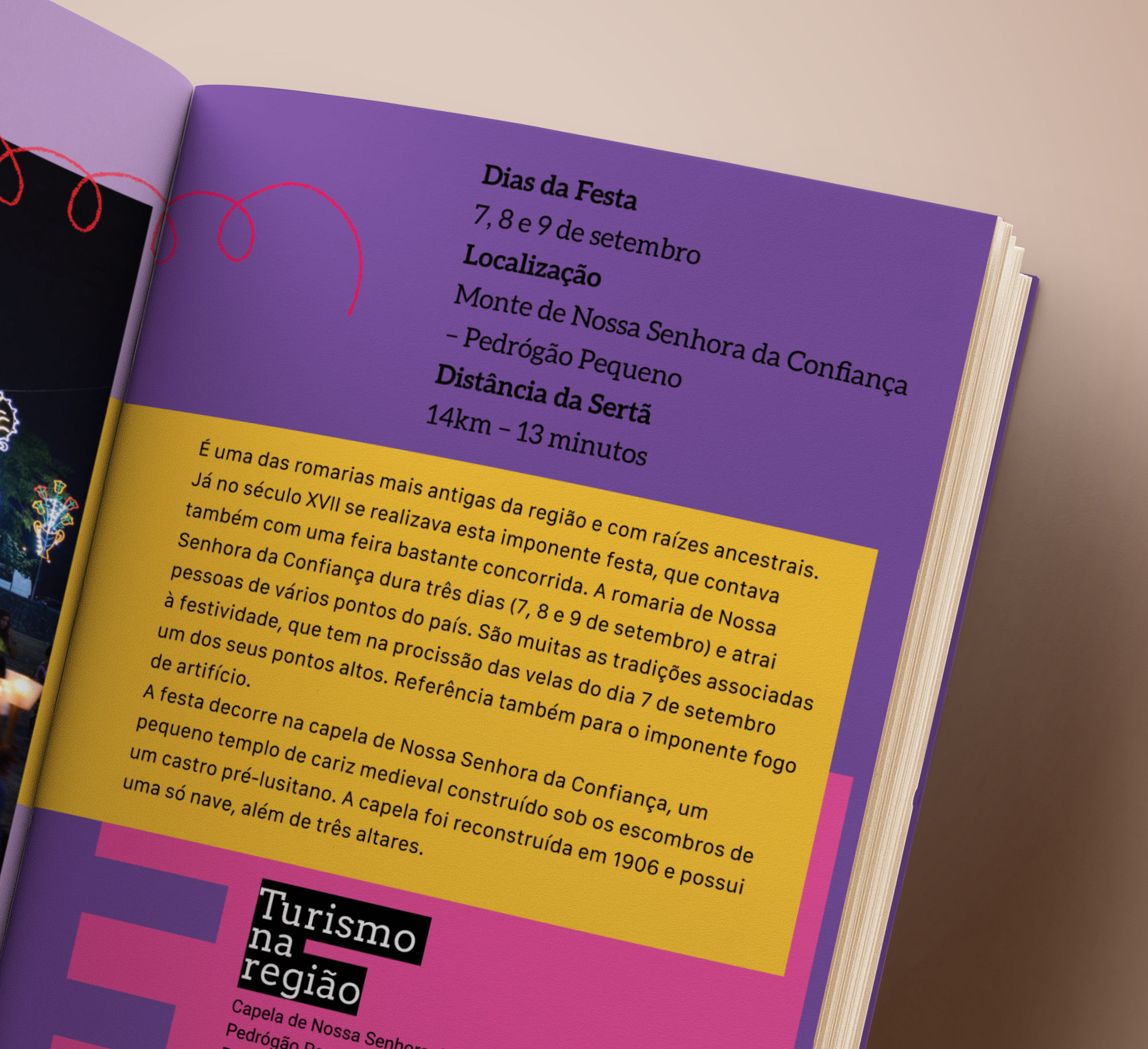
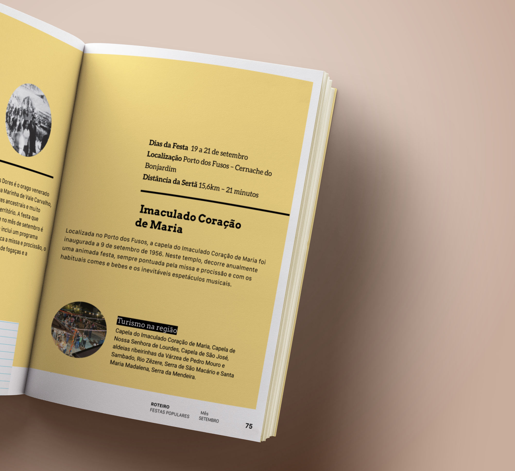
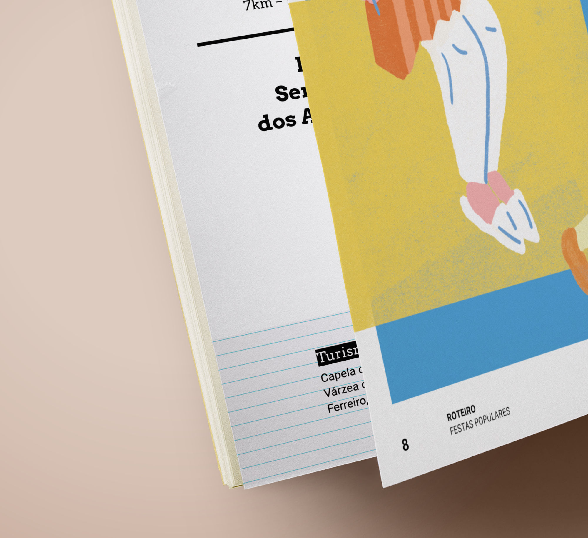
Final Product: Function and Evolution
Ultimately, this editorial design turned a simple guide into an essential companion for all festival-goers. Through a thoughtful blend of intuitive design and elegant layout, the guide becomes more than just a schedule—it’s a window into the rich history and vibrant traditions of the Popular Festivals of Sertã, making every experience more complete and enjoyable.
Let’s create something awesome
Whether you’re launching a project, reimagining a brand, or exploring new possibilities, we’re ready to partner with you and bring bold concepts to life with precision and purpose.
