Blog > All Articles
Small-Format Design: Making Every Detail Matter
Half the Size, Twice the Style
22 May 2025
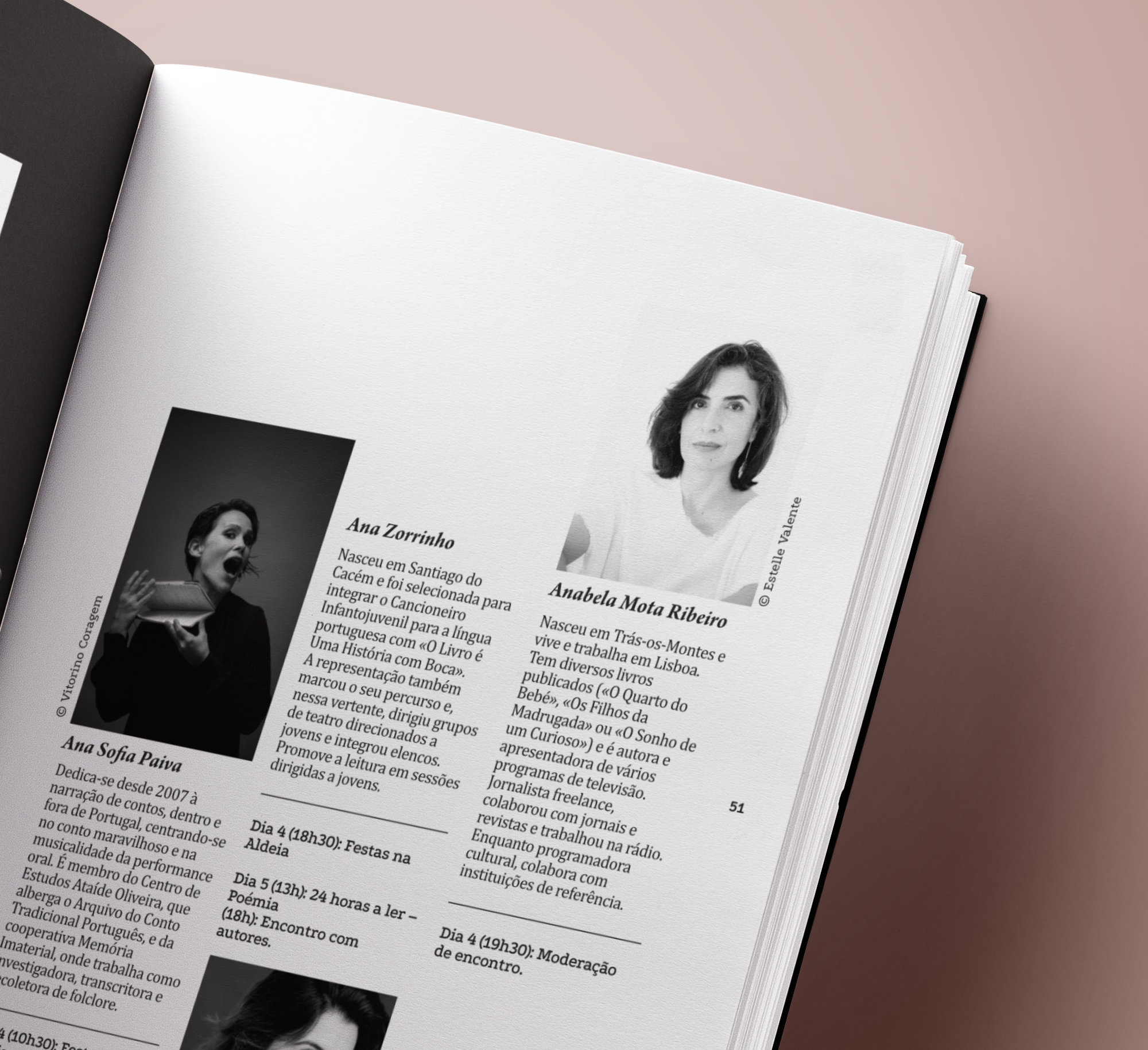
Working with small-format layouts quickly turned a limitation into a fun creative challenge. We learned plenty, not from books but from trial and error (and a few design freak-outs).
It was a process of figuring out how to make small look sharp, where every word, every image, and every margin mattered and we actually enjoyed it.
Size Doesn’t Matter (Unless You’re a Font)
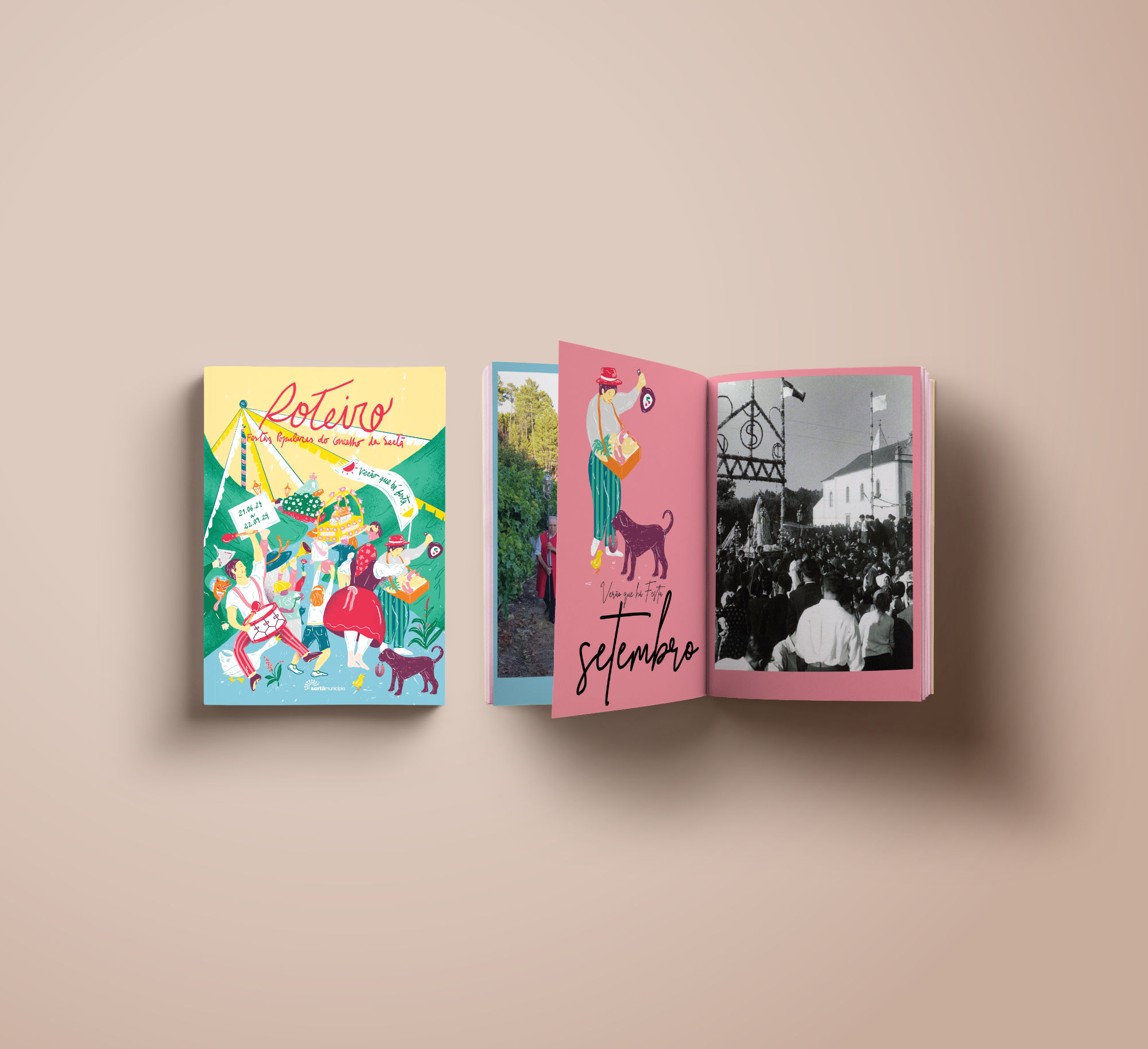
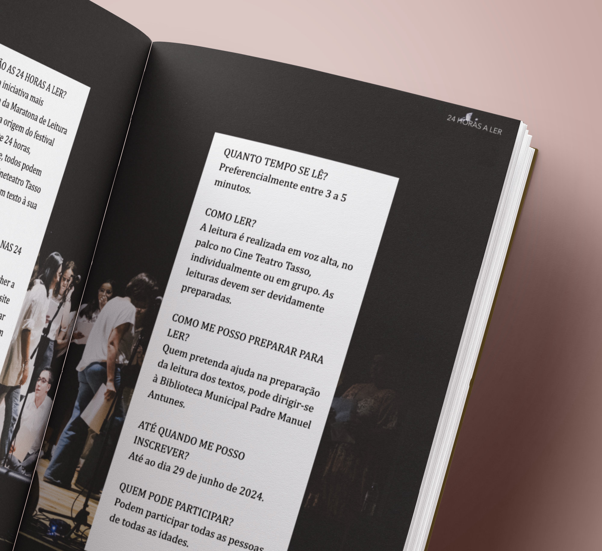
When it comes to small formats, choosing between one or two columns might seem straightforward — but it’s not that simple. A single column feels safe, clean, and easy to read. It’s comfortable, almost like reading a book, where your eyes just flow naturally.
Two columns, on the other hand, bring a completely different energy to the layout: the text feels tighter, snappier, and the space is used in a new way. You get these little “pause points” — almost like a conversation between columns. And it’s not just about structure — it adds rhythm and a touch of creativity to the design. Trying to squeeze three columns onto a tiny page? “Say what? I just said it.”
In practice, switching between one and two columns depending on the content and the message usually works best. It’s not all-or-nothing. It’s about feeling what fits that specific moment — and, of course, keeping the purpose of the piece in mind. Sometimes, mixing both approaches in the same publication results in something unexpectedly great.
Single or Double? Let’s Mix It Up!
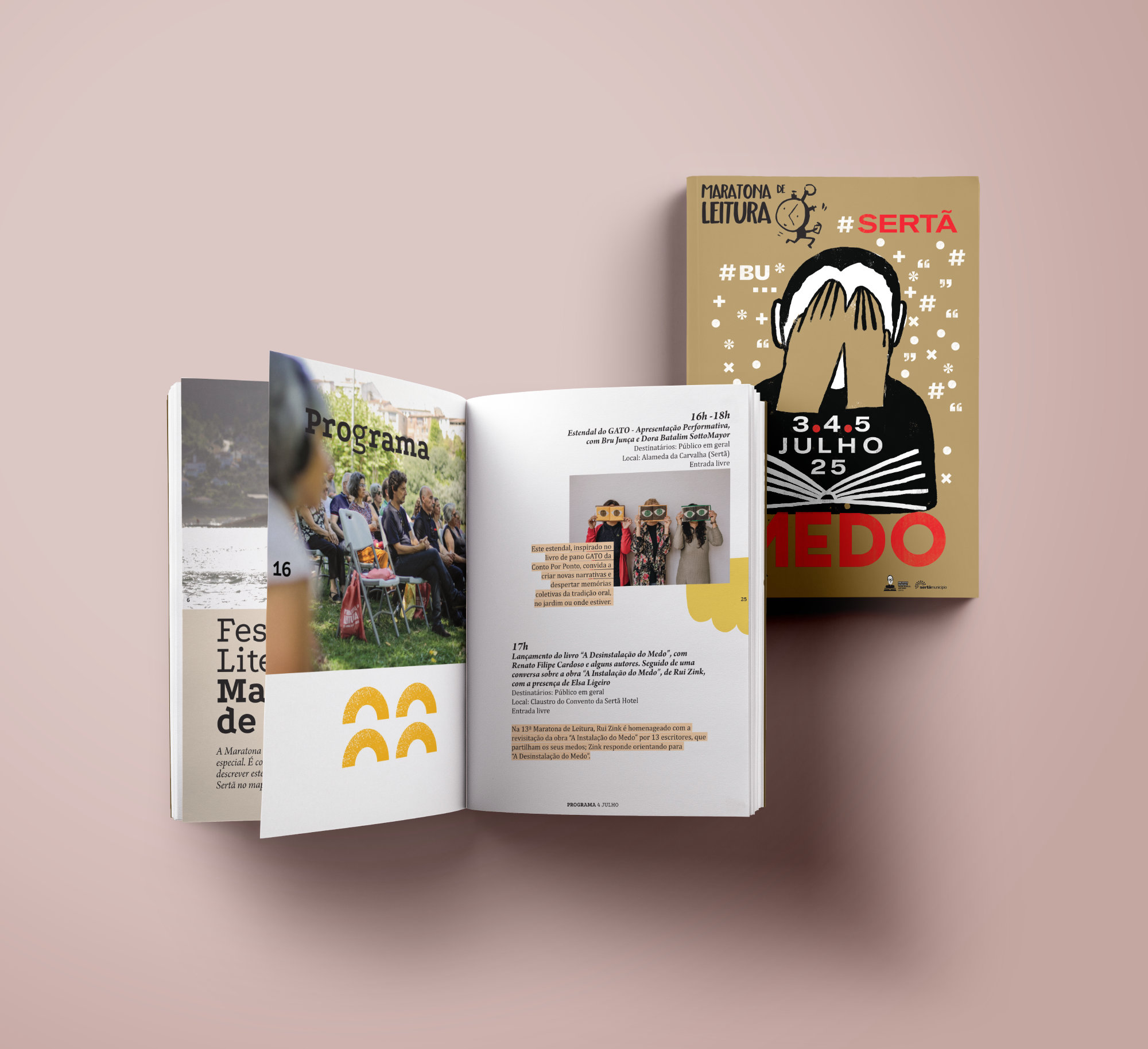
When it comes to small formats, choosing between one or two columns might seem straightforward — but it’s not that simple. A single column feels safe, clean, and easy to read. It’s comfortable, almost like reading a book, where your eyes flow naturally.
Two columns, on the other hand, bring a completely different energy to the layout: the text feels tighter, snappier, and the space is used in a new way. You get these little “pause points” — almost like a conversation between columns. And it’s not just about structure — it adds rhythm and a touch of creativity to the design. Trying to squeeze three columns onto a tiny page? “Say what? I just said it.”
In practice, switching between one and two columns depending on the content and the message usually works best. It’s not all-or-nothing. It’s about feeling what fits that specific moment — and, of course, keeping the purpose of the piece in mind. Sometimes, mixing both approaches in the same publication results in something unexpectedly great.
Page Flow: Keeping It Smooth
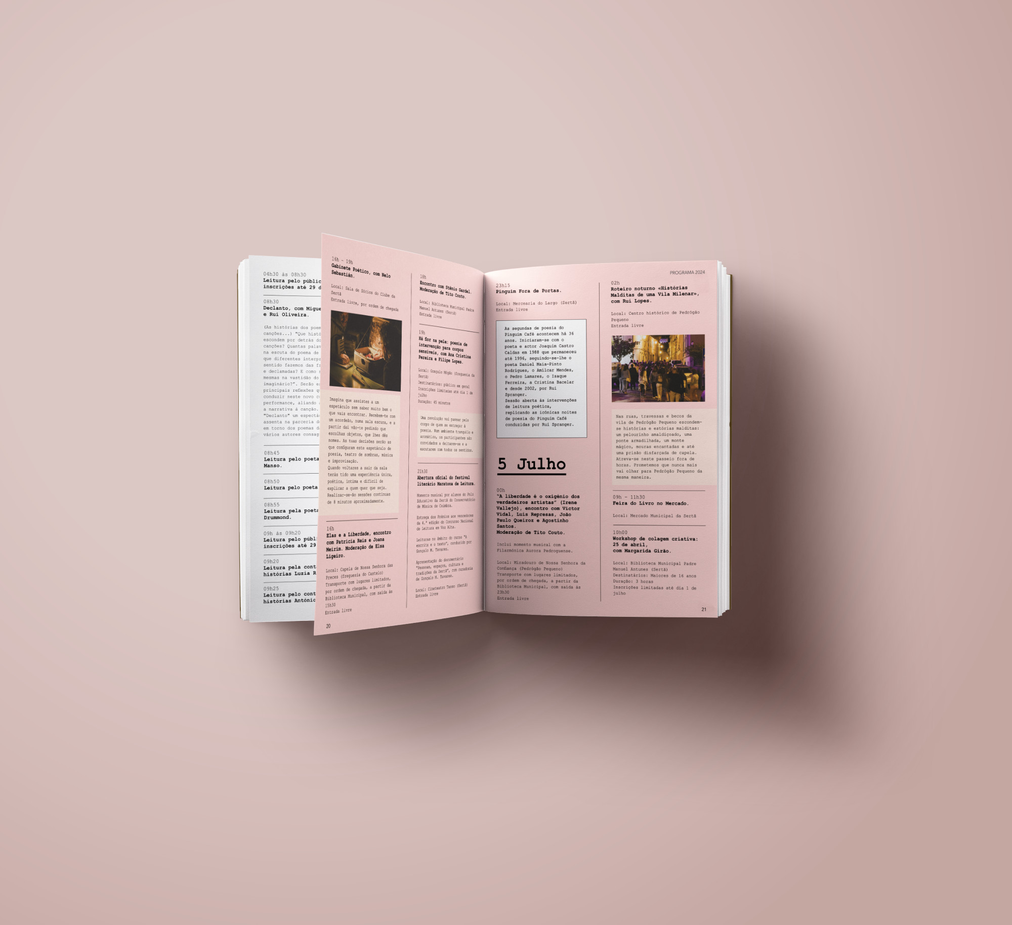
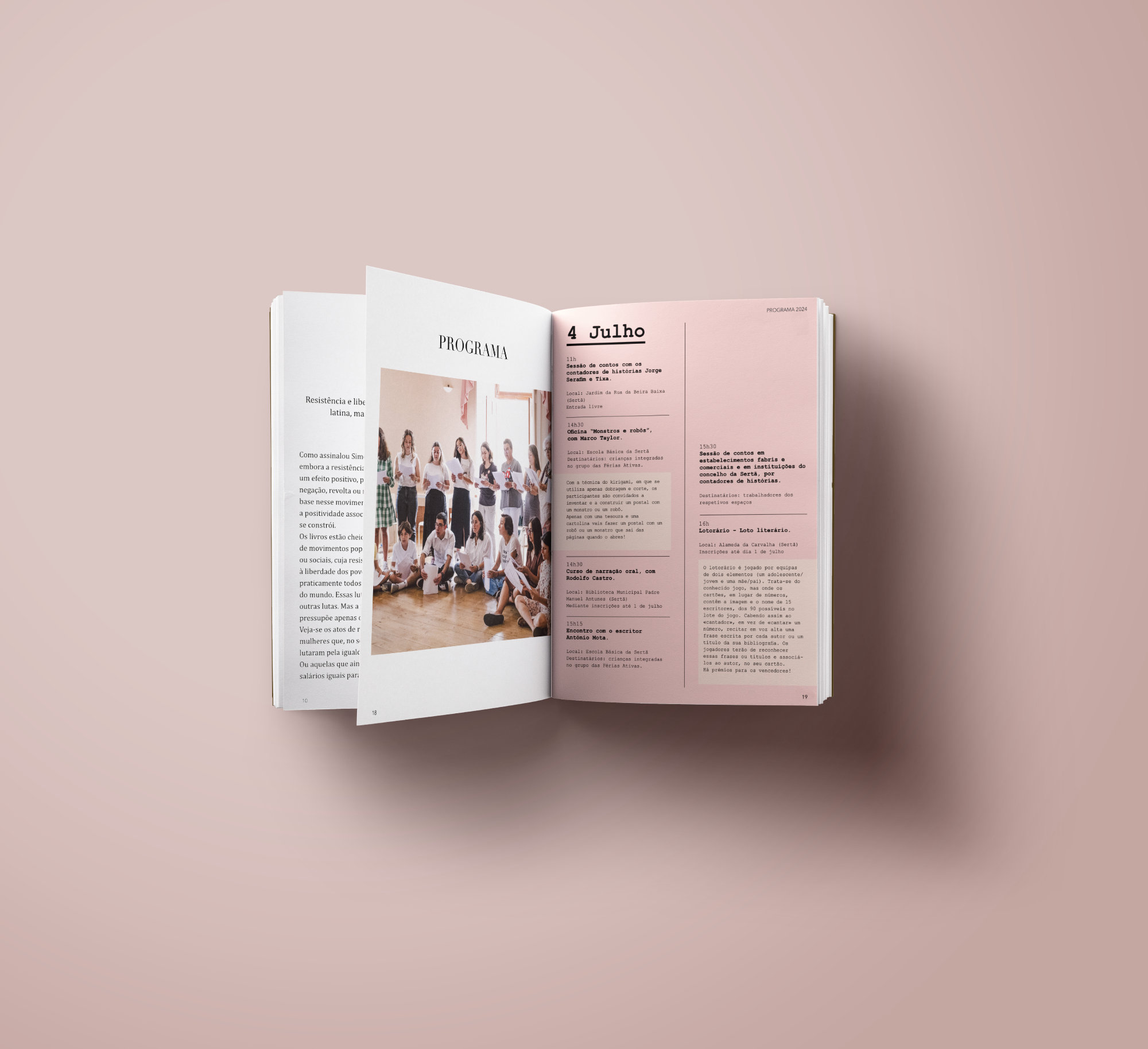
Small formats are a natural choice for zines, catalogues, programs, and editorials — publications that call for portability, quick impact, and easy reading. But working within this frame demands precision: space is limited, and every element needs to serve a clear purpose.
Adapting longer content to these publications is a creative challenge. It requires rethinking pagination not just as a technical step, but as a visual narrative — where text and image are balanced to maintain rhythm and interest. It’s a carefully choreographed dance between content and format.
Every photo or illustration must be chosen with intention — there’s no room for filler. Images should add value, reinforce the message, and offer a visual pause. The text, in turn, has to be clear, concise, and finely tuned so it doesn’t get lost in the layout.
Visual rhythm makes all the difference — breathing space, subtle type variations, strategically placed images, and well-timed callouts all help create a natural flow that guides the reader. When everything clicks, the reader doesn’t get lost in the information — they’re carried through it with ease and engagement.
In the end, working in a small format is an exercise in synthesis, intention, and rhythm. And when it’s done right, the impact is anything but small.
© A NEW DAY, 22 May 2025
Let’s create something awesome
Whether you’re launching a project, reimagining a brand, or exploring new possibilities, we’re ready to partner with you and bring bold concepts to life with precision and purpose.
